Design Exercise: PetSuites App
After using PetSuites services for nearly a year, I grew tiresome of the manual process of boarding my Golden Retriever. Though you can easily find locations near you, booking a reservation online was unnecessarily complicated and it was often times easier to drive down to the facility to reserve a spot in advance than through their website. Drafting a solution quickly became a side passion project for me.
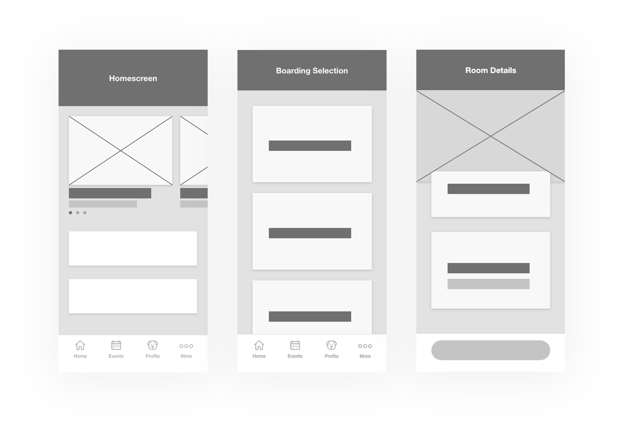
Wireframes
PetSuites offers various services at multiple levels, which users likely subscribe to on a regular basis. Understanding that most users will come to the app already knowing what service they’d like to book, I created an interface that would allow them to head straight to the menu item of choice without isolating new users that want to learn more.
This wireframe allows users to select a service then customize their options on a details page.
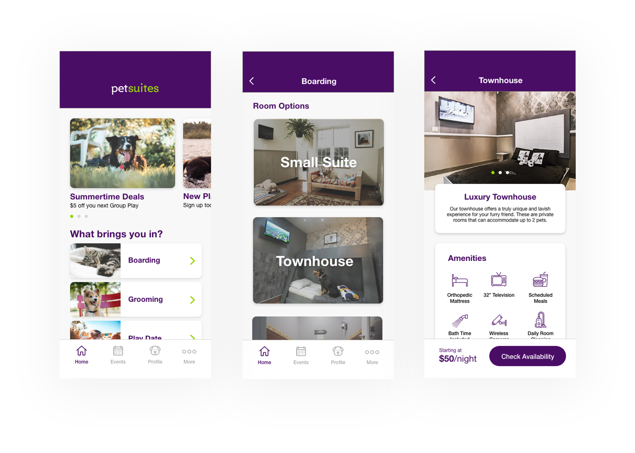
High Fidelity Wireframes
Photos and additional branding was added to further help visualization of the app.
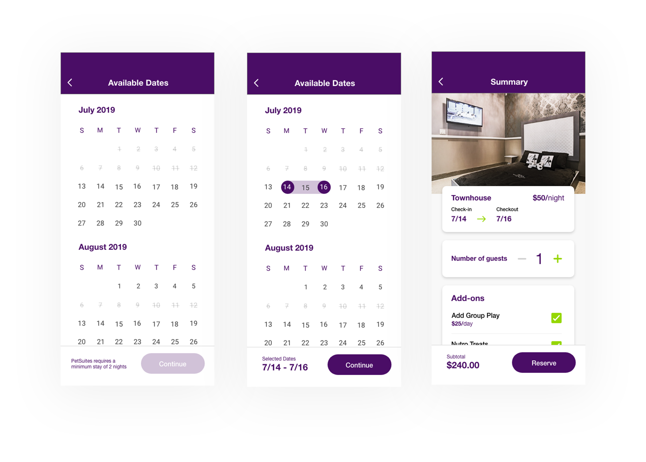
Dates and Add-ons
I adopted the standard calendar view, familiar to most users that use digital booking services, to create a seamless flow along with a summary page that allows the user to view and adjust add-ons to their reservations before confirming the booking.
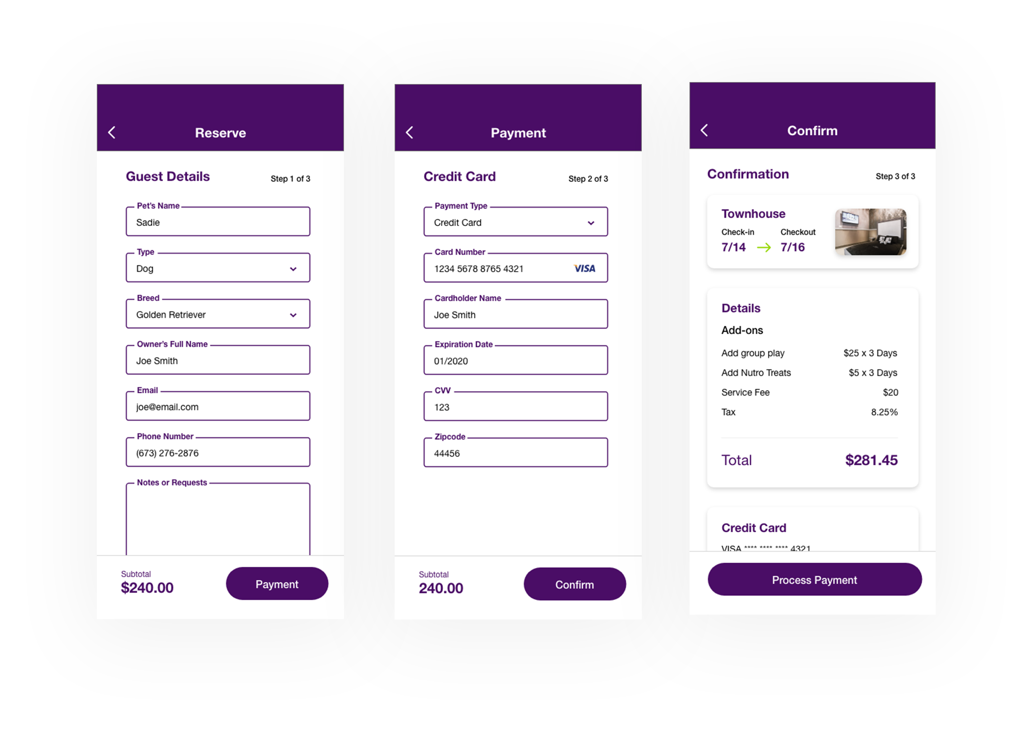
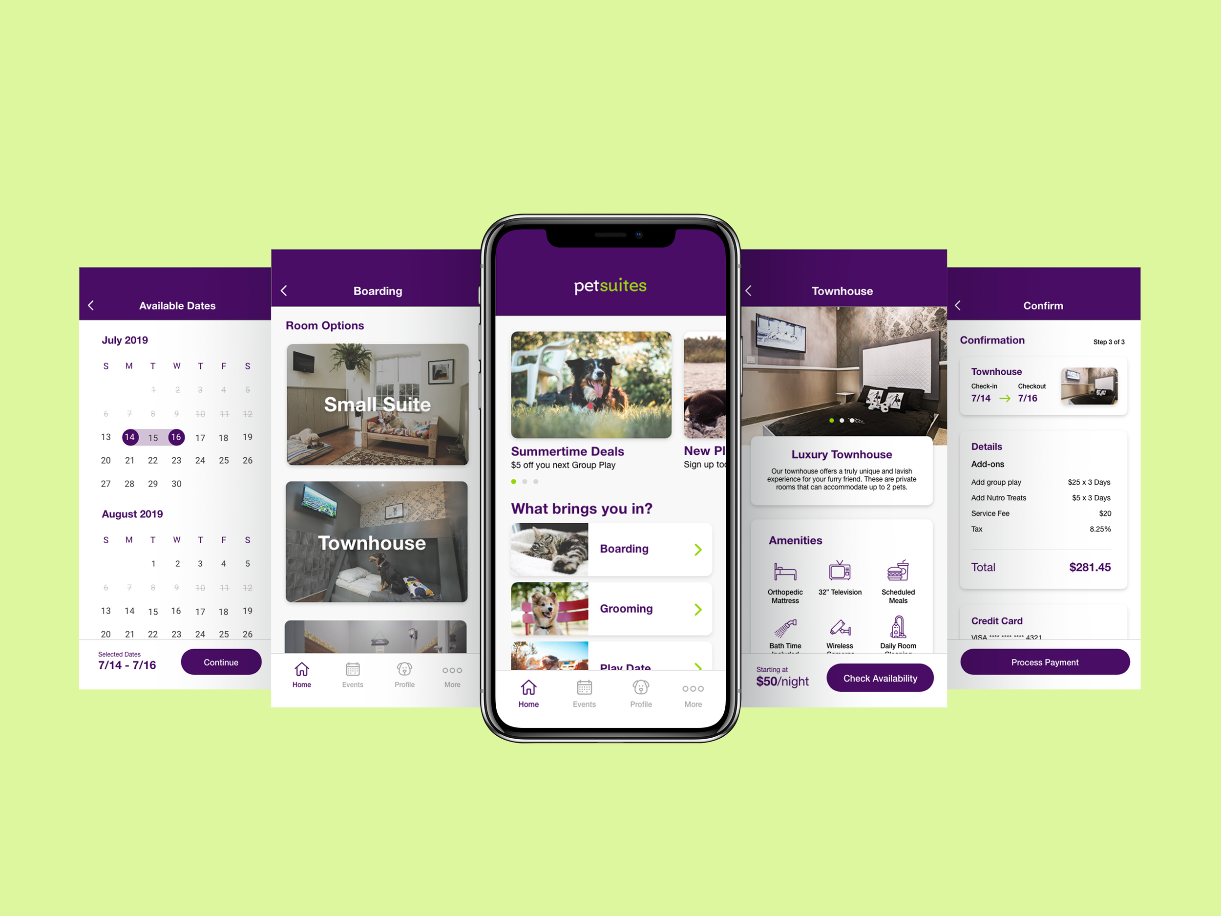
Checkout
The checkout process was consolidated to three simple steps of clear and natural fields. As with the date and add-ons, including a summary page is imperative to mitigating user error, providing them with one more opportunity to confirm the details were accurate.